Digital Bar logo
Chilldesk

Understanding the UX scoring

An independent metric for UX standards

DigitalBar is unique. No other service provides an independent metric of UX standards in the Insurance Sector where one Insurer Brand's online product journey can be compared usefully to another Brand's on the same terms. An apples to apples comparison

IMG 7655

Championing UX best practice

UX is a nuanced discipline. In a real world UX project, design decisions are influenced by a wide range of factors - context, specific research, user observation & testing, expert judgement. This said, there are principles and conventions born out of an ongoing global effort of iteration and testing by the UX design community (approx. 3m practitioners worldwide) and this produces best practice.

UX expert Pancentric Digital champions this best practice as it relates to insurance and reflects the prevailing standards in its DigitalBar UX scoring criteria. 

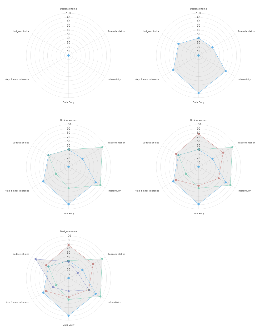
Radar Ii

Structured UX assessment

Pancentric's DigitalBar UX assessments are highly structured featuring 50+ checks across 5 usability categories. Design Scheme, Task Orientation, Interactivity, Data Entry, Help & Support and an additional reviewer's score. A proportion of the checks are graded scores and a proportion are binary scores. The binary scores apply to areas of fundamental UX hygiene. A weighting is applied to some of the UX scoring categories.

All journeys for all brands are reviewed on the same basis to achieve the apples to apples comparison. The scores are a guide only but give an indication of prevailing UX standards.

Simon (1)
DigitalBar is unique. No other service provides an independent metric of UX standards in the Insurance Sector where one Insurer Brand's online product journey can be compared usefully to another Brand's on the same terms. An apples to apples comparison. Simon Fenn, Director, Pancentric Digital

Example scoring scenarios

Binary scoring - UX hygiene

When a UX hygiene principle is satisfied the check is scored '+1'. If the principle is not satisfied, the check is scored '-1'. Examples; 

Design scheme
Complicated backgrounds are avoided and colour doesn't distract and dominate.
Satisfied? = Receive a score of +1. No? = Receive a score of -1.

Interactivity
Hypertext links are easy to identify (e.g. underlined) - no need to 'minesweep' 
Satisfied? = Receive a score of +1. No? = Receive a score of -1.

Data entry
Text boxes are an appropriate length for the data expected to be entered.
Satisfied? = Receive a score of +1. No? = Receive a score of -1

Help & Support
Context sensitive help is provided - simply expressed, free from jargon.
Satisfied? = Receive a score of +1. No? = Receive a score of -1.

-----------------------------------------------------------

Graded scoring examples

Design scheme
Content on the page is structured in consistent grid, pages utilise reusable components, so visitor can learn how to use the system quickly, and learn once only.
Graded 1 to 5, where 5 is excellent and 1 is poor

Task orientation
When there are multiple steps, all the steps that need to be completed are clearly displayed and feedback is provided on the visitors current position in the journey (e.g. effective use of progress bar and appropriate inline validation)
Graded 1 to 5, where 5 is excellent and 1 is poor

Some changes have also been made to the weighting of the UX scoring categories.

Pancentric Digital provides a range of UX design and customer research services.