Let's give the Voluntary Excess question a happier, better home
Published on: November 1, 2023
Updated on: September 3, 2024
The question about Voluntary Excess (or deductibles as it's called in the US) is something of a beef for the UX team at Pancentric. It's a lost soul of a question with many online insurer brands misjudging its deployment. Here is our UX assessment and guideline to future design.

Don't ask the question early - not helpful
Insurers tend to bundle the voluntary excess question in with their other risk questions. It crops up in all sorts of strange places - in ‘About you’, ‘Your property’ etc.
Sequencing it early in the quote journey offers no advantage to the Insurer and is bad UX.
See it from the customer’s viewpoint
Take your average customer.
Skipping through questions about their house construction or whether their car has a manufacturer-fitted alarm and they’re suddenly faced with it - THE VOLUNTARY EXCESS QUESTION.
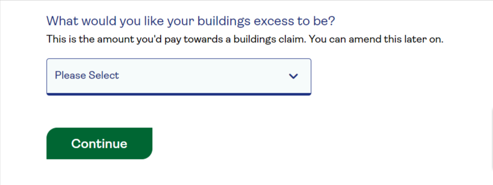
The question stops you in your tracks. It’s quite a technical-insurancy-legal sounding thing - ‘voluntary excess’ - not to an underwriter of course, but to mostly everyone else.
CUSTOMER: “Umm. I've got no idea what I’d like to pay. Zero would be good. Is that a silly expectation? How am I supposed to know the answer to this question?”
If you’re a seasoned insurance buyer, you may have a view on the level of excess you’d typically want to pay. But many aren’t in this camp. Some people don’t understand what voluntary excess is. Plenty don’t appreciate that there is a compulsory level of excess already built into their insurance policy, so opting for a middling voluntary contribution could as much as double what they have to pay in the event of a claim, which can be a bit of a shock in your time of need.
Don't ask questions people can't answer
Typically, insurers offer a range of voluntary excess values for customers to choose from - from £0 up to £500 or even £1000 depending on the policy and the insurer.
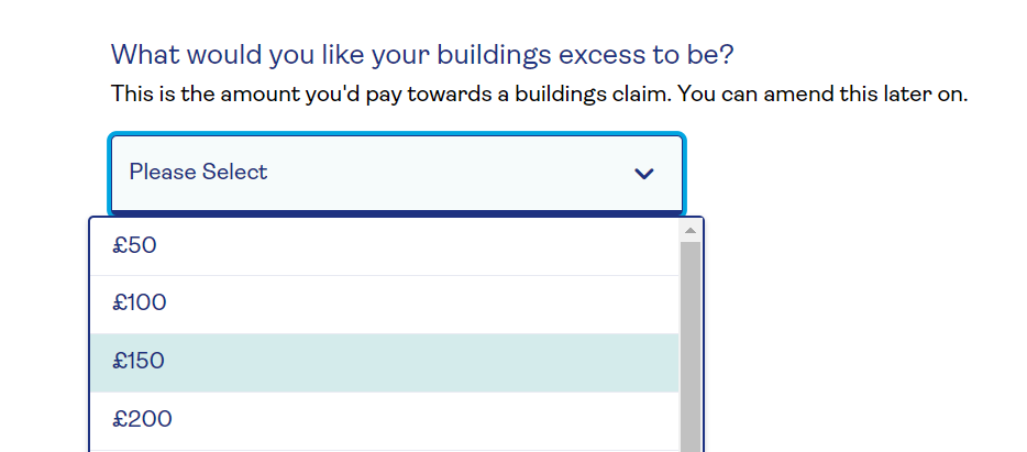
Most insurers give sidebar tips on how increasing your voluntary excess may help you reduce your insurance premium. Whilst its good to be familiar with the principle, how useful is this on its own?
People need to be able to an informed decision and this doesn't cut it.
Users need specifics, not principles
CUSTOMER: “Okay, I kinda get the principle. But what saving are we talking about? If I opt for a £100 excess what will this save me on my premium, versus say a £500 excess?”
The insurers give no specifics. Because they can’t. They’ve got a stack more questions still to ask you to determine the premium, let alone any savings. The definitive financial benefit of a voluntary excess selection at this early stage of the quote journey cannot be known.
So why ask the question here? It’s pointless, serves no value.
USEFULNESS is a key aspect of good UX and this is not useful.
Education is welcome
Hats off to Lloyds Bank for trying to demystify the business of excess.
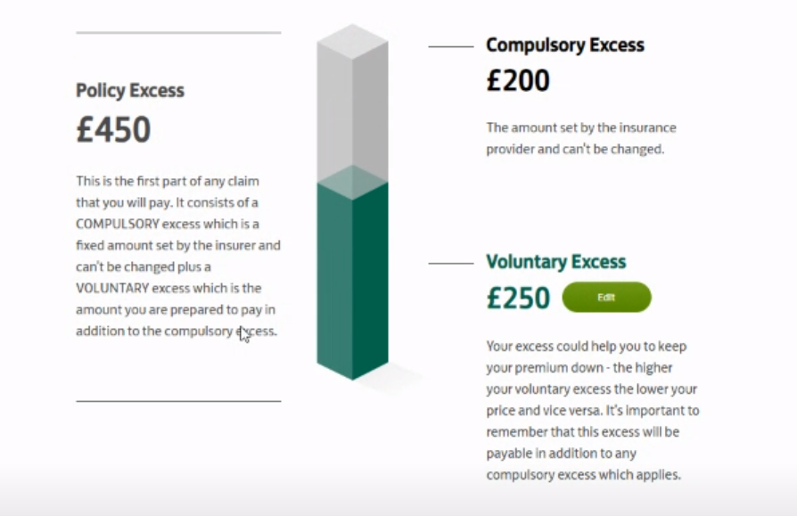
Their interactive tool on their Home Insurance quote journey helps clarify that there are two elements, compulsory excess and voluntary excess, and that ‘upping’ or ‘downing’ the latter will impact the total amount that you pay in the event of a claim.
The tool is good but would be better if it also showed the impact on premium - instantly, as it instantly shows the impact on payment at claim. Frustratingly, any premium recalculation is presented on a separate screen, after a short processing delay. It's easy to lose track of the before and after values.
Quote summary page is the place to ask
The quote summary page is where the voluntary excess question should live.
From the insurer perspective, you’ve asked all your questions. You’re now in a position to present a premium and recalculate this if the customer wants to change their voluntary excess.
It’s good to see increasing numbers of insurers locating the voluntary excess question on the quote summary page and offering customers the option to see how a higher/lower excess can reduce/increase premium. It's the right thing to do - to give the customer ALL of the information they need to make informed, grown-up decision.
QuoteMeHappy - good but too much scroll
QuoteMeHappy features the voluntary excess question on their (Car) quote summary page, but there’s a lot of vertical scrolling between the changing of an excess value and viewing the recalculated premium.
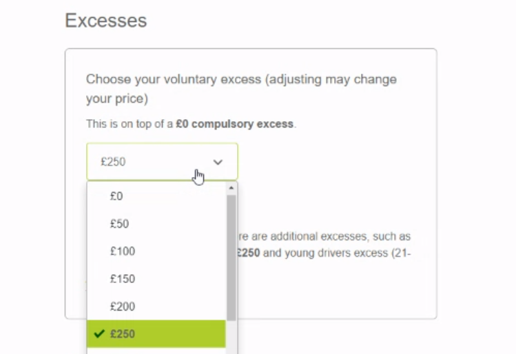
Churchill - easier to see impacts
Like QuoteMeHappy Churchill locates the question on the quote summary page, but goes one better by showing the recalculated premium within the same view via a sticky header feature.
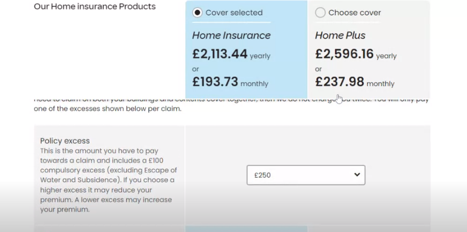
Churchill also rolls the compulsory and the voluntary excess values together which simplifies the proposition. They make this clear in the question, along with an explanation of the principles.
Top marks to AA
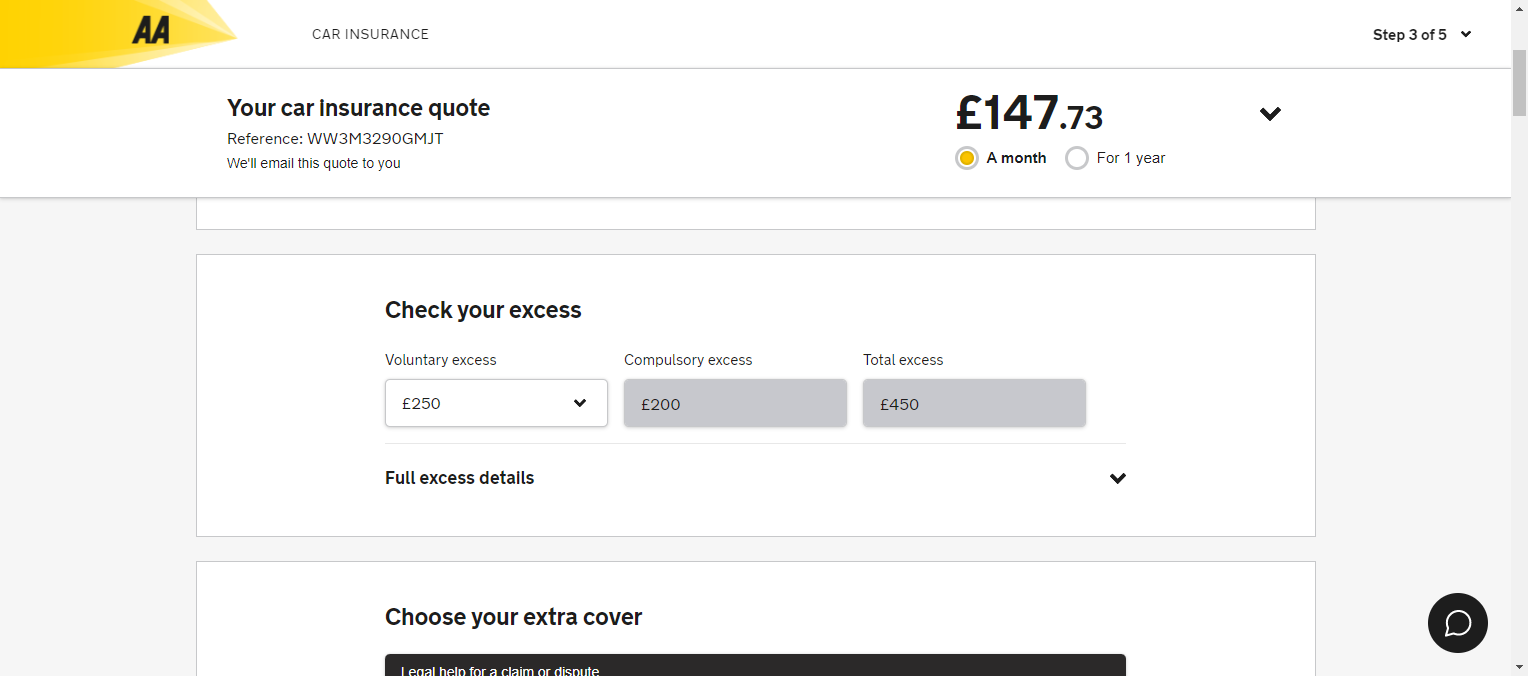
Same approach as the guys above, the AA locates the question on their (Car) quote summary page. The premium is always in view, presented in a sticky header (with the option to toggle between monthly and annual payment). The excess value is selected via a simple to use dropdown. The compulsory excess is shown alongside the voluntary excess and the combined total excess is also shown. All very clear.

Our 8 UX rules for voluntary excess
1. Don’t ask customers questions they’re not fully equipped to answer.
2. Locate the voluntary excess question on the quote summary page.
3. Provide your initial premium based on a zero or low to middling voluntary excess and then allow the customer to edit the excess value.
4. Make it crystal clear that they CAN edit the voluntary excess value.
5. Instantly show the change to the customer’s premium when they change their voluntary excess. Make this easy.
6. Make it crystal clear that there is also a compulsory excess.
7 Show the TOTAL excess value and the compulsory and voluntary amounts.
8. Explain the principles and implications of the total excess at claim. Illustrations welcome.
